You are using an out of date browser. It may not display this or other websites correctly.
You should upgrade or use an alternative browser.
You should upgrade or use an alternative browser.
Barcelona 2012/2013 kits revealed
- Thread starter MaestroXavi
- Start date
Puyol the wall
sent-up-the-bomb
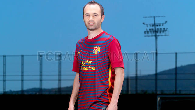
13/14 home kit i guess.Is this a jersey or a shirt?
cloned warrior
New member
13/14 home kit i guess.
looks like training kit!
Puyol the wall
sent-up-the-bomb
Might be a shirt, Nike might take this design and make it as the new home jersey in 2013.looks like training kit!
La Furia
Legion of Doooom
Somehow they look even worse on the players than they did before that.
I almost like the away kit. It's so bad that it's entertaining. Like Meta said perhaps the tequila sunrise effect will be similar to the bright yellow of the past.
The home one though is blasphemy though. I thought this years was bad, the spider-man kit might be ugly but at least it isn't hideous.
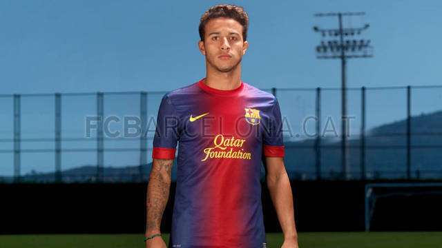
Thiago almost pulls it off just because he's a BMF. Pique looks hilariously uncomfortable in it.
ammarfcb
ze special one
Clockwise
Buccaneer
Might be a shirt, Nike might take this design and make it as the new home jersey in 2013.
Something very unholy is going to happen to the nike big boss come summer of 2013
Deco 20
Scandinavian 101
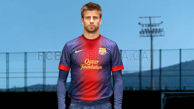
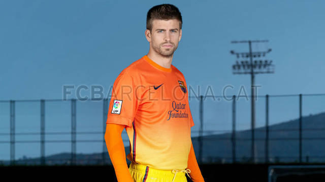
Take a look at Piqué... he obviously feels unfomfortable wearing that shit.

Same with Thiago... "wtf is this shit? it's hideous... well... look relaxed and look at the camera... no tension... it's ok.. damn I'm scared"
#3Home is excellent, away looks maid in PowerPoint....
If I'm not wrong, this were the options last season.... All are way better than this ones...


WHY can't we just have that design?!
Just make the blue slightly darker and it's perfect. The grana is spot on.
Last edited:
FiReFTW
Member
The home kit is ugly and not very Barca but can be dealt with I guess... The away kit is just an abomination, terrible terrible design...
Exactly my thoughts...
Whats with the horrible kits in the past years?
Metaphysical
Bomb Dropper
fairly certain those kit shots are 'shopped, like the ones of Puyol & Thiago from last season, which is why the lads have such blank expressions on their faces.
Blue Demon
New member
Pique looks odd with short sleeves. Might look better with his usual long sleeve kit.
Overall the home will grow on me; I like the away kit.
Overall the home will grow on me; I like the away kit.
Fourteen
Monster Masch
Pique looks odd with short sleeves. Might look better with his usual long sleeve kit.
Overall the home will grow on me; I like the away kit.
Ha ha ha...yeah.....wait what?
