Germany

suckabov

Lemon curry?
No black shorts? Good, that hopefully means they'll stop playing "Schwarz & Weiß" after every freaking game. Also clever to bring back the colours of the German flag on the jersey, black/white/green are too indistinguishable colours for the en vogue team that Germany has become. Also, I couldn't care less about jerseys.
 
Last edited:

suckabov

Lemon curry?
Do my eyes deceive me or has Weidenfeller really been called up for a Germany match? Löw must be coming to his senses.
 

Luftstalag14

Culé de Celestial Empire
New DFB home trikot released today.

Mueller_Draxler_Fan_Trikot2_48853_p880722.jpg
 
Last edited:

Luftstalag14

Culé de Celestial Empire
The design is growing on me quite a bit in the last couple of days, I must say. I will order a Schweinsteiger one.

14germanyhome.jpg


14germanyhome3.jpg
 
Last edited:

suckabov

Lemon curry?
According to adidas, the white illustrates the "lightness and elegance" and the flag the "playfulness" of their game. Aha.
 

suckabov

Lemon curry?
So it has nothing to do with the German flag? Bunch of traitors.
Of course it does, it is the flag - but the way it is presented indicates playfulness, because of its form and different colours (or something). Germans don't like showing the German flag too much btw, so that's a compromise.
 

Luftstalag14

Culé de Celestial Empire
Of course it does, it is the flag - but the way it is presented indicates playfulness, because of its form and different colours (or something). Germans don't like showing the German flag too much btw, so that's a compromise.

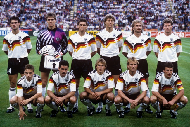
They would have made a lot of people (including me) happy if they could simply copy the 1990 design. It featured the original colors of the flag as they should be.

PA-8191634.jpg
 
Last edited:

suckabov

Lemon curry?
Not in Germany, no. I personally think that one was especially ugly. The idea behind this was to show the change in the football they play. It's much more elegant and sophisticated now compared to those days, adjectives nobody would associate with German football pre-2006 or 2008. In that sense, good job, although I find it fascinating how much "thinking" they put into the design :lol:
 

Luftstalag14

Culé de Celestial Empire
Not in Germany, no. I personally think that one was especially ugly. The idea behind this was to show the change in the football they play. It's much more elegant and sophisticated now compared to those days, adjectives nobody would associate with German football pre-2006 or 2008. In that sense, good job, although I find it fascinating how much "thinking" they put into the design :lol:

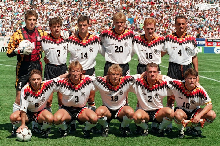
Ugly? Nah. Classic. It is my second favorite design, and the favorite is this, from WC 1994, of which I am a proud owner (a Klinsmann one). :party1:

94%2520%25282%2529.jpg
 

Home of Barca Fans

Top