You are using an out of date browser. It may not display this or other websites correctly.
You should upgrade or use an alternative browser.
You should upgrade or use an alternative browser.
New 2022-2023 Barca kits
- Thread starter Jefecito
- Start date
soul24rage
Senior Member
I am so sad that fan concepts are almost always better designed than the corporate ones.
Birdy
Senior Member
Hmmmmmm

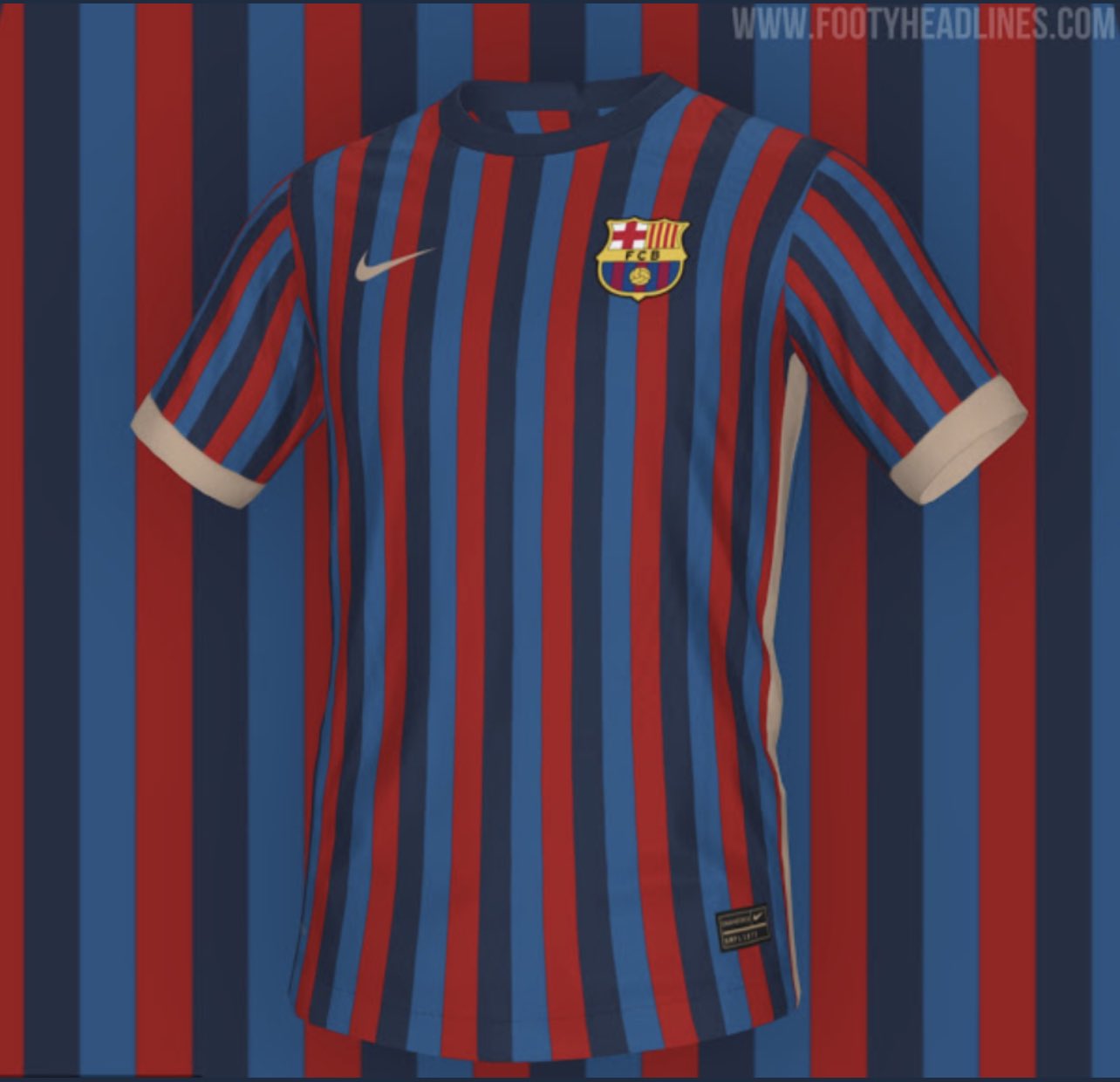
I don't get why they make glaring stylistic mistakes.
For example, here you have the 3-color stripe. Some people like it, some don't. That's fine.
But then you have to be consistent with the outlines of the design as well.
The way they have the beige (whatever shade) line down each side is totally off when in conjunction with isolating one of the 3 colors, the navy blue, and using it for the collar.
You either have to use the navy blue for both collar and side stripes, or use the beige for all of them.
Luftstalag14
Culé de Celestial Empire
I don't get why they make glaring stylistic mistakes.
For example, here you have the 3-color stripe. Some people like it, some don't. That's fine.
But then you have to be consistent with the outlines of the design as well.
The way they have the beige (whatever shade) line down each side is totally off when in conjunction with isolating one of the 3 colors, the navy blue, and using it for the collar.
You either have to use the navy blue for both collar and side stripes, or use the beige for all of them.
Agreed, the beige color lining the edges of the sleeves and torso looks completely out of place and forced. They are only using it to pay tribute to some old color scheme we had in the 90's. Using a color for the sake of using it is just stupid.
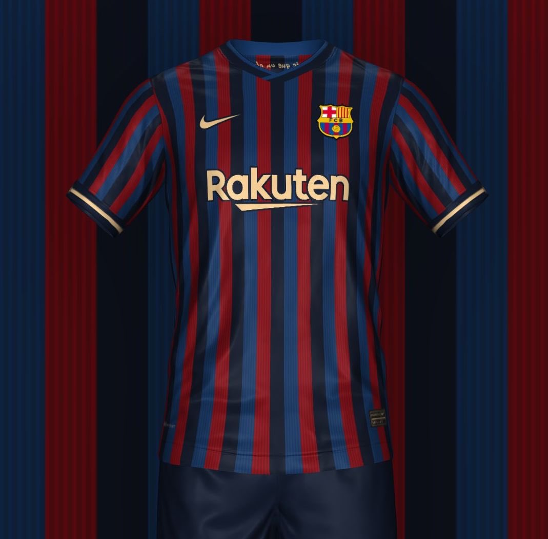
And look at the wonders darker shades (for the blue and red) can do.
Joan
Well-known member
Think this is fan made, looks better than the footyheadlines leak though:

The leak looks much better to me. Some bad calls which will hopefully be changed.
Birdy
Senior Member
Another concept kit by a fan, which is miles better than the actual ones:

https://www.footyheadlines.com/2021/04/nike-fc-barcelona-21-23-mash-up-kit.html

https://www.footyheadlines.com/2021/04/nike-fc-barcelona-21-23-mash-up-kit.html
Blaugrana Bull
HiiiPoWeR
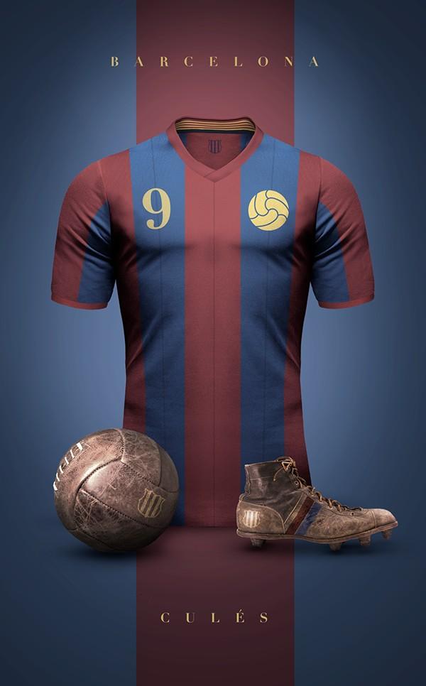
21/22 is ugly and 22/23 is ugly too. Just give me some classic stuff and experiment with the other shirts. They are at least 4 a season now ffs.
If there just one really nice shirt among those, people will buy lots of it so the money will come in. This year's black shirt or first Senyera kit are amazing and people love to buy it. A home shirt with classic design will always be bought too.
If there just one really nice shirt among those, people will buy lots of it so the money will come in. This year's black shirt or first Senyera kit are amazing and people love to buy it. A home shirt with classic design will always be bought too.
Blaugrana Bull
HiiiPoWeR
https://twitter.com/_Bands_FC/status/1387009314968199169/photo/3
Meanwhile in Amsterdam. This is going to be one of the most sold shirts ever.
Meanwhile in Amsterdam. This is going to be one of the most sold shirts ever.
https://twitter.com/_Bands_FC/status/1387009314968199169/photo/3
Meanwhile in Amsterdam. This is going to be one of the most sold shirts ever.
David Neres happiest man in the world right now.
Fati_Future_BallonDor
Well-known member
Blaugrana Bull
HiiiPoWeR
JerseyAddict
Well-known member
It has bothing with the kits anymore... They are melting in heads :/


