You are using an out of date browser. It may not display this or other websites correctly.
You should upgrade or use an alternative browser.
You should upgrade or use an alternative browser.
Messigician
Senior Member
wtf were they smoking in 2007
View of all the stadium designs from 2007-2016
Messigician
Senior Member
I actually like the final barto design with the 360 screen
serghei
Senior Member
I like the current design the most, but they need to deliver the stadium built exactly like in the renders. If they cut some corners in the production, it can look pretty boring on the outside. Being simple, they really need to populate the outside promenade decks just like in the initial renders with various leisure amenities (couches, tables, some food shops, stuff like that) so that fans can actually relax on the outside and admire the scenery of the city while they wait for the match to begin.
Of course this can also be done in time.
Of course this can also be done in time.
companyofcules
Well-known member
companyofcules
Well-known member
(Since there's a lot of Bernabeu discussion in this thread going on...)
Lol, it's always entertaining to see how different fanbases manipulate reality based on their biases and end up having completely different opinions and reach polar opposite conclusions on the same topic.
As a Madrid fan here are some things I can personally say about the Bernabeu:
1. Personally I generally like what they have done with the exterior, but it's not perfect and it will/can still be improved. Based on reports, there's going to be a ~15 million+ euro investment on interior and exterior lighting and on image projection technology to be used on the exterior. In a way it can be said that the Bernabeu's "image" or identity in the night has not been activated yet, hence why the club doesn't provide much exterior camera viewing angles during the night on match day transmissions and why there aren't much official images from the club of the stadium during the night yet. The strong, uncalibrated, industrial, and temporary interior lighting being used at the moment, coupled with the basically non existent exterior lighting, end up producing a bad, ugly image imo, but that is expected to change. As far as I'm concerned the exterior during the night can't be really judged yet.
Then, during the day, I generally like the gargantuan, modernist, minimalist, cold austerity of the new enveloping skin. It brings to mind ideas of forward thinking, avant-garde grandeur and the stainless steel brings to mind the European Cup, and impenetrability. From street level I think it looks great during the day and vaguely okay during the night (it's from farther distance and heights that it currently looks terrible in the night imo). The problem I have with it is that during the day, particularly on the western and southern facades, there's a certain transparency that can be seen from mid-long distance and at certain heights during selected times of day, which gives those facades in particular a certain industrial vibe that I find to be a mixed bag. That is also not a finished thing though as they are still painting and reconditioning the old exterior that's behind the new enveloping skin, they may still change some of the steel panels, and they still haven't put the name and crest on the western facade yet.
As to the comparisons of the exterior to tuna cans or toilet bowlsthat is to be expected from hate-fueled or otherwise "compromised" perspectives, and it even inherently comes with the territory of modernist architecture, you could say similar things about the Allianz Arena and I'm sure opposing fans of other German teams do say that (I find the Allianz Arena to be beautiful from the outside, but not emblematic in any way of Bayern Munich as a club) and people have been saying similar things about the avant-garde works of Frank Gehry or Zaha Hadid, for example, for decades.
My current rating on the exterior/expected final rating:
Day Street Level: 7.5/8.5
Day Helicopter Level: 7.0/8.0-8.5.
Night Street Level: 6.5/8.5
Night Helicopter Level: 3.0/8.5.
It's the transparency that adds a lot of variability to the aspect of it all and that personally makes it unlikely for me to give the finished overall facade higher than an 8.5 overall. The transparency is a result of the necessary distance between the steel panels, the distance and inclination is there to allow for better ventilation of the inside and so that the skin breathes a bit and doesn't just look like a heavy and impenetrable thing, and it is also a nice thematic touch for one to see an interplay between the old facade and the new one, and it does look nice during the day at street level. It's the mid to long distanced aerial views of the western and southern facades that "suffer" somewhat for my taste.
As for the interior....
I find it to be breathtaking, and for my liking I give it a 10/10 already, and there's still another LED screen ring expected to be added to the one that already exists (not to be confused with the 360 viewing screens.)
From an engineering and technology aspect, it is an avant-garde gesture to have a retractable roof, pitch, and the 360 screen board, and the sight the stadium produces from the interior, particularly during the day is astonishing, I think. Additionally, as is the case with the unfinished exterior, the retractable pitch system is still in its infancy and they are still calibrating things, the conditioning of the pitch system will undoubtedly keep improving as time goes on.
As time goes on, in the coming decades newer, bigger, more advanced stadiums will inevitably be built around the world and in Europe, and what's avant-garde at one point is logically always at risk of looking quaint as time goes on as people build on top of previous advancements, but what the Bernabeu has with its interior, I think, will remain both functional and timeless. And it's necessary considering how the club wants to use the stadium as a multipurpose 360 days a year complex.
I think the 360 board is great, especially considering the limitations that the remodeling project had to work with. Only the Sofi Stadium's do I currently find more "impressive".
I don't say this to remove impressiveness from what the new Camp Nou promises but I'm personally not one to place too much importance on a stadium being the "biggest" in the world or having 100k+ seating. If the renovated Bernabeu had that it wouldn't be one of the aspects that would personally most interest me, much less when at its 80k+ seating it's already one of the biggest big team stadiums in Europe.


companyofcules
Well-known member
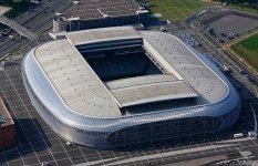
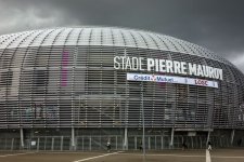
So on short your project is not a copy of Allianz but a plagiarism of a french stadium.
CN first project was a poor copy of Allianz but thanks to that Japanese guy and Barto art sensitivities we got something unique.
CN first project was a poor copy of Allianz but thanks to that Japanese guy and Barto art sensitivities we got something unique.
Xtroverto
Member
It is sad they did not include the designs from the 1980s, some of them were quite spectacular, once of the proposals had a ginormous grandstand built over the main stand, with 16.500 seated. If it had bee built Camp Nou would have had 115-116k all seater capacity today.
View of all the stadium designs from 2007-2016
DonAK
President of FC Barcelona
Return possibly delayed even further to March and could be later too.
companyofcules
Well-known member
Big works and the entry is dependent on the parking
Messigician
Senior Member
Yes that’s realistic we can’t rush these thingsReturn possibly delayed even further to March and could be later too.
Messigician
Senior Member
This is an LWell Limak gonna pay for each day of the delay according to the club, when presented the timetable. Let's see how fast they'll progress in summer.
You can have things fast and cheap but it will be low quality
You can have high quality and fast but it will be expensive
You can’t have cheap fast and high quality…
They will just start cutting corners now and they’re already the cheap option compared to Catalan companies
Messigician
Senior Member
“ Laporta is ruining our vision for the stadium, a plastic roof and cheap materials under the guise of sustainability”
-Josep Maria Bartomeu
-Josep Maria Bartomeu
Last edited:

