New 2015-16 Barca Kits

Status
Not open for further replies.
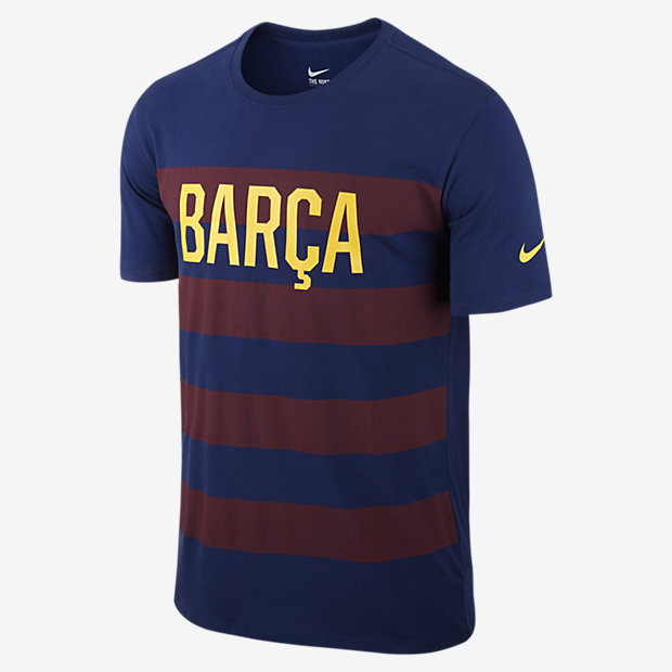
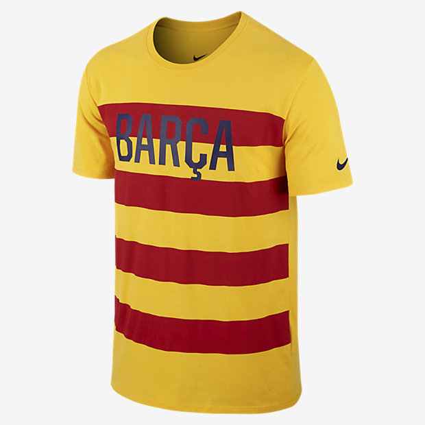
the senyera looked great last season.
Before that the 09 10 was alright, and the 08-09 was awesome so i tend to agree.

Although shamelessly brazil oriented, i dig our next away too.
 

Luftstalag14

Culé de Celestial Empire
Finally after a long while your second kit looks good. It's been ugly for a while.

Welcome Wavy my friend!

In my opinion our away kit for the new season is so ugly, worse than what we had in the last several seasons.

Those stripes would have to be broken off to create an empty square in the middle should we use it for the CL games. Huhh....
 

Wavy

New member
Wait a minute? Which one is the away kit? I'm talking about the yellow one. I also like the one with the horizontal stripes.
 
F

Flavia

Guest
Thoughts on this shirt?

2015-07-19_VIAJE_USA_02-Optimized.v1437297440.JPG


FCB-MATCH-TEE-689702_421_A.jpg


FCB-MATCH-TEE-689702_739_A.jpg


I think it looks weird, like the front was supposed to be the back of the shirt.
 

serghei

Senior Member
I don't like the font, but other than that, I like the minimalism of the design. Minimalism is the way to go now IMO, cleaner, simpler, more classic. But I can't help thinking that those letters look like they've been cut out with a pair of scissors.
 

slvtn

Member
New kits look weird on the pitch, but the red shorts are cool. We should keep them for the next seasons.
 
Status
Not open for further replies.

Home of Barca Fans

Top