New 2022-2023 Barca kits

Vilarrubi

New member
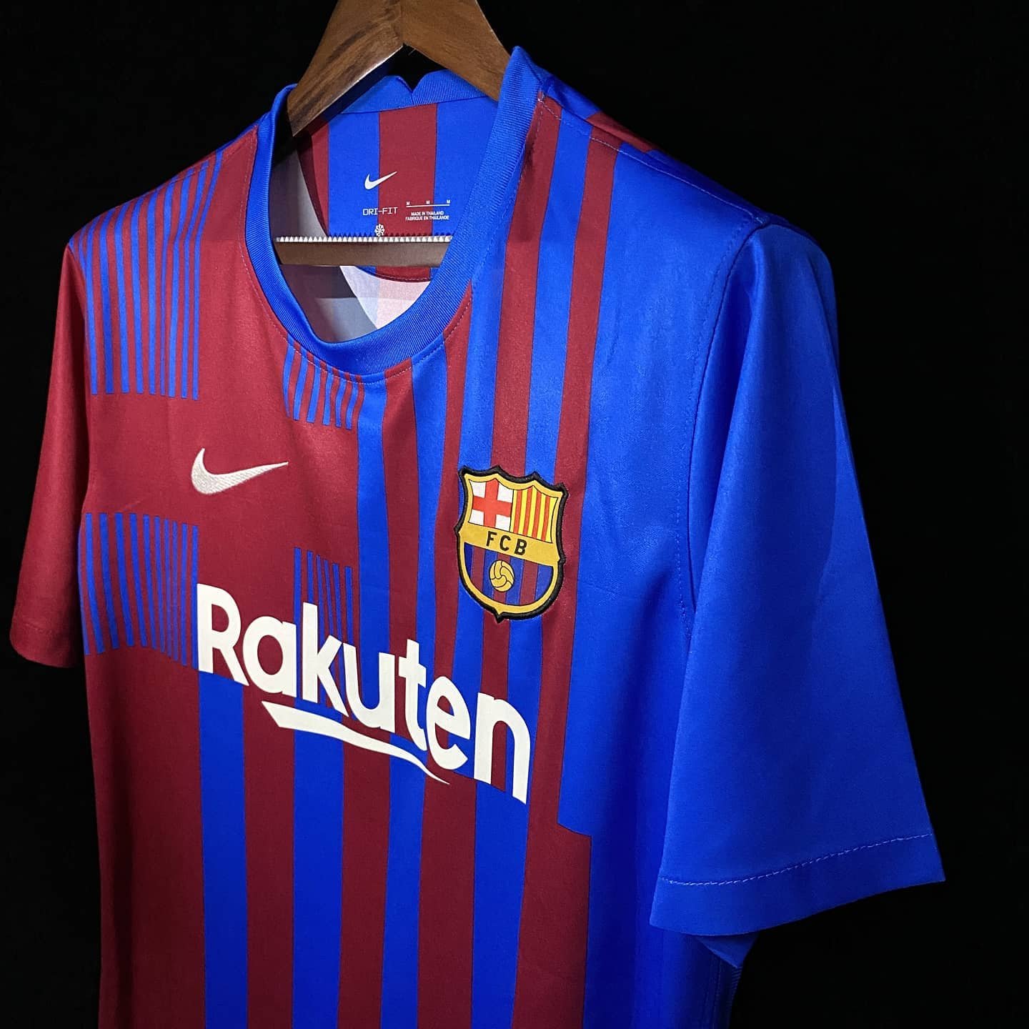
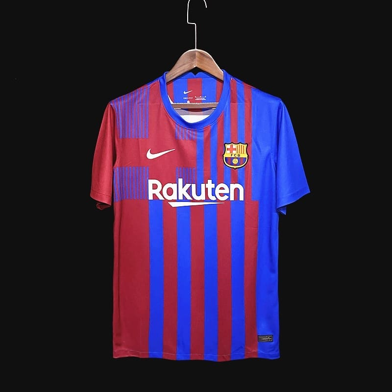
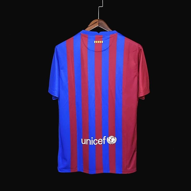
Seen this concept on Twitter, unreal. 1999/2000 throwback. Nike designers should be sacked.

EwJAMmNUYAQVUbL
 

Windhook

Well-known member
I don't get the idea - why duplicate St. Jordi's cross in the design when it's already on the emblem right there on the same kit?
 

Richard.H

Senior Member
I just don't understand why Nike keeps messing up these kits so badly. These new pics look even uglier than the previous. As a jersey collector, it's really irritating to me.
 

Luftstalag14

Culé de Celestial Empire
Nevertheless, like all the other "ugly" shirts we had before when they were first leaked, I suspect this jersey will grow on people as the new season starts and people see players wearing it in action, and hopefully many will buy it as it will be important to our bottom line.

The authentic VaporKnit version should make it slightly better.
 

Joan

Well-known member
Design is awesome.
Agree about the shades. IMO either make it like 08/09 shades (standard red and blue) or go darker.
Indeed that particular shade of blue combined with that particular shade of red makes us look like crystal palace.
Whereas the lighter blue and darker red in the leaked version of a Barca hat by FootyHeadlines makes a better color combination:
https://www.footyheadlines.com/2020/09/fc-barcelona-21-22-home-kit.html

Don't like the beige -whatever shade it is - of Rakuten and Nike. It will be also on the player numbers.
Yellow or Gold should always be there.

I agree. Love it.

The more I look at it, the shades look better too.

Will buy for sure.
 

Andresito

Senior Member
Staff member
Let's hope they go for a black and gold away/third kit :wub:

We have such a potential to have beautiful kits. Just google barcelona concept kits. Many, if not most, are usually much better than the ones we actually have.

This type of away kit would be great, like the one from 2004/05.
barcelona_third_kit_x_puma__04_05_concept_20200205_1253288621.jpg

barcelona-concept-kit.jpg
 

te amo barca

Blaugrana al vent
It's like a badly made collage. Looks really similar to the 11/12 kit, which I hated too. Not a fan of darker coloring and that number of strips.
 

Home of Barca Fans

Top