You are using an out of date browser. It may not display this or other websites correctly.
You should upgrade or use an alternative browser.
You should upgrade or use an alternative browser.
Barca kits (new 2024-2025)
- Thread starter Andresito
- Start date
TheStig
Member
This!
Whenever Nike tries to produce something beautiful, after many abhorrent designs the last many years,
they always mess it up someway in the details
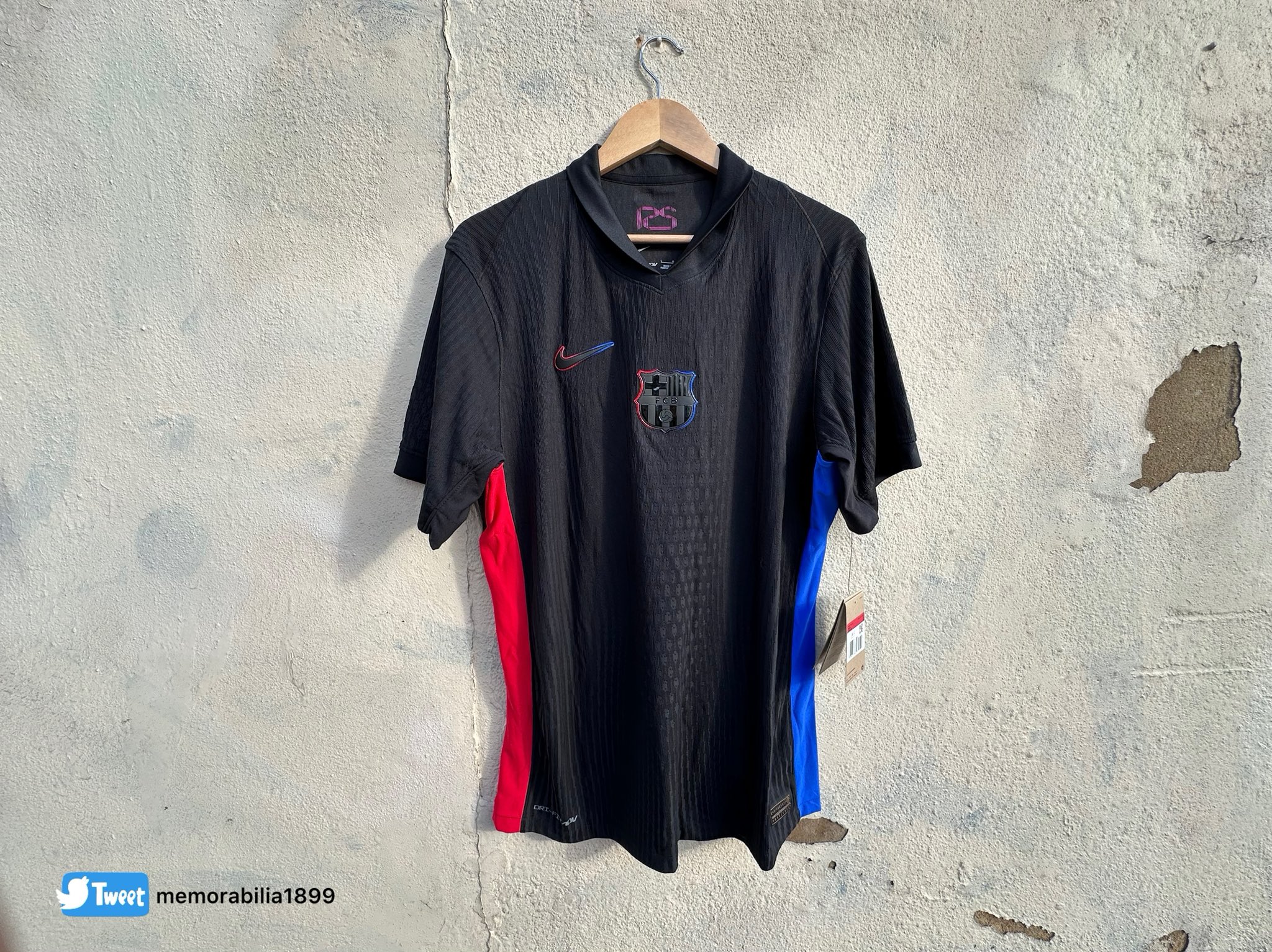
Now, they had the 'total black' concept, which even included blackening the crest (IMO the crest of all clubs in all kits should never change form or colour. But I will leave that aside for now)
So, the nike swoosh and the crest were blackened with only blue/red outline, not even visible.
And then they go and throw in your face a bright RED Spotify logo FFS
At least be consistent with your own ideas, and with the overall design of the kit, and blacken the spotify logo likewise... Why is it so difficult to not mess up self-evident things?
I'm sure Spotify would be very happy if their logo was not visable.
Birdy
Senior Member
It will be as visible as the crest, and in line with the overall design.I'm sure Spotify would be very happy if their logo was not visable.
They can't ask their logo to mess up the overall deisgn
In any case, the designer and club have the final say on a kit
Besides, spotify logo is very visible in the 1st kit, and it will be advertised everywhere in the new Camp Nou.
They won't be having such issues
Birdy
Senior Member

You get an idea of how much better the 2nd kit could have been if the spotify logo was blackened as the crest
Same for the panels. They don't fit the idea. The idea is total black.
Same for letters and names. Should have been silver or so. Bright red creates a bad contrast with black
Fati_Future_BallonDor
Well-known member
Wow like it, something new and not always the same style
I actually agree. Not that I would wear it myself though.Wow like it, something new and not always the same style
Fati_Future_BallonDor
Well-known member
With this green and the black jersey we will win away matches with ease
MonteCuler
Well-known member
Looks like shit guys from fire department would wear
Really hope it looks better on the pitch, probably will
FCBarca
Mike the Knife
Why is the logo vertical like that? Looks like something off alibaba
Of course I’m not fond of the black either which actually looked better during match on players - I think the red accents on side help
The home one though, I love - just wish the players version was available
Nike rollout is shite
Of course I’m not fond of the black either which actually looked better during match on players - I think the red accents on side help
The home one though, I love - just wish the players version was available
Nike rollout is shite
Birdy
Senior Member
Oh Gosh! A Green-ish abomination
Worst of the three, and top 10 worst away/3rd kit the last 20 years...
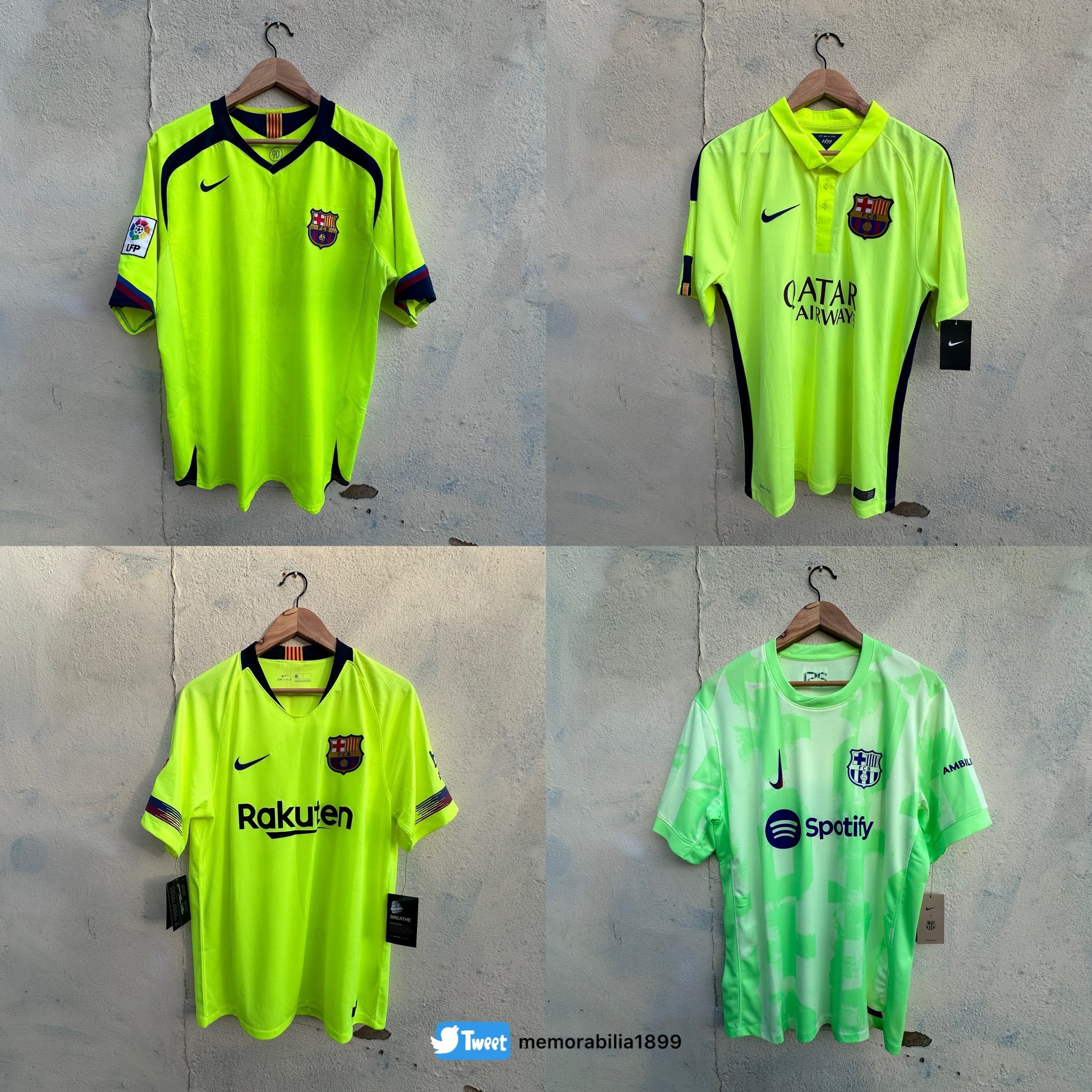
Look, Barca have had many times neon-yellow kits, even in CL winning seasons 05/06 and 14/15, like the ones below:

But green?? That's just too much, you see how it does NOT fit with the other three
Let alone the bad military-camouflage design
Really hope we wear the 4th Senyera instead more times this season
FCBarca
Mike the Knife
Well, I learned the rationale for the vertical swoosh - interesting
As with many of Nike's third strip designs for their select elite teams, the Swoosh on the chest has also been doubled and inverted to signify that the kit forms part of the brand's "Together We Rise" movement -- a celebration of the pivotal role women's football is playing in the growth of the modern game.
As with many of Nike's third strip designs for their select elite teams, the Swoosh on the chest has also been doubled and inverted to signify that the kit forms part of the brand's "Together We Rise" movement -- a celebration of the pivotal role women's football is playing in the growth of the modern game.


