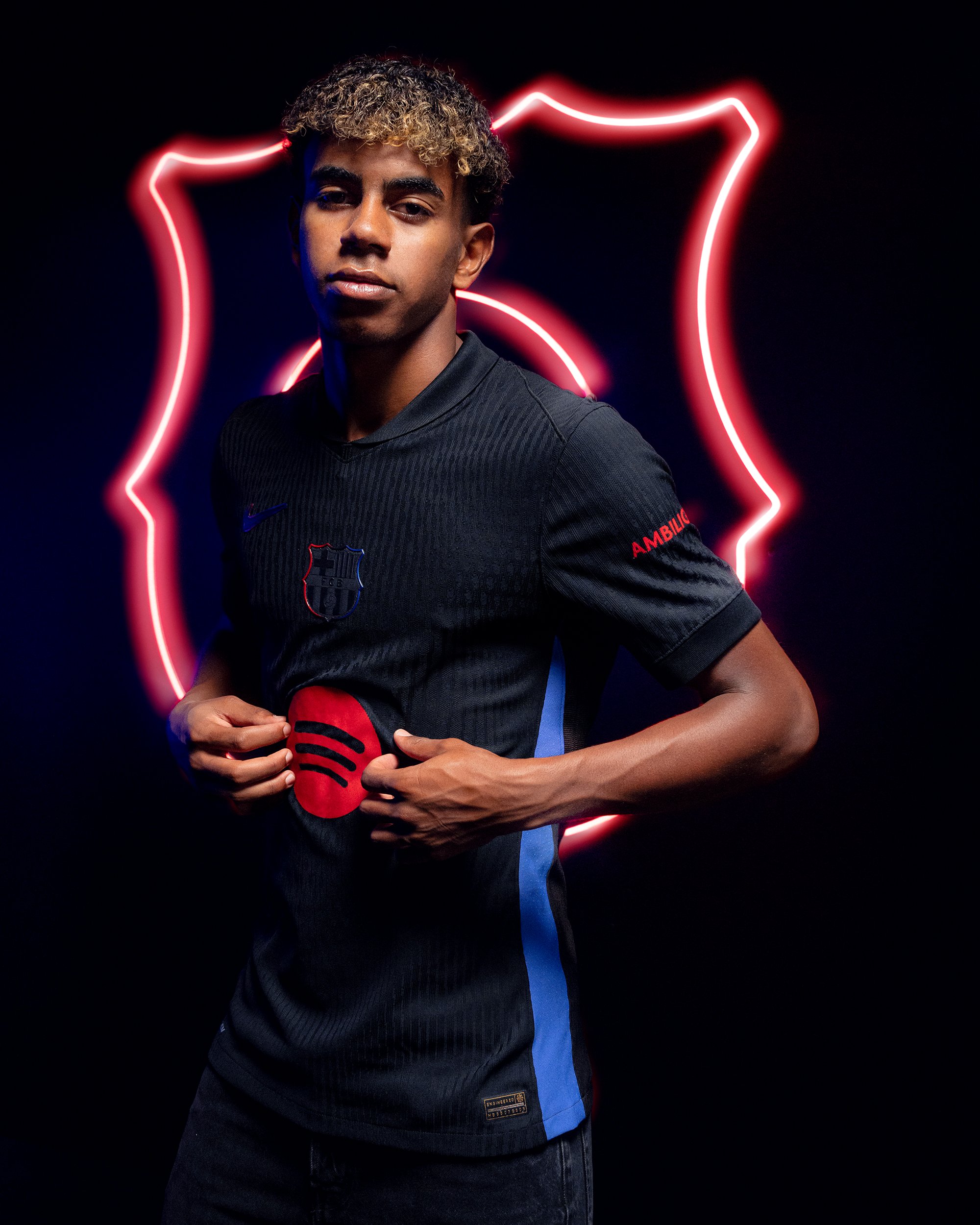
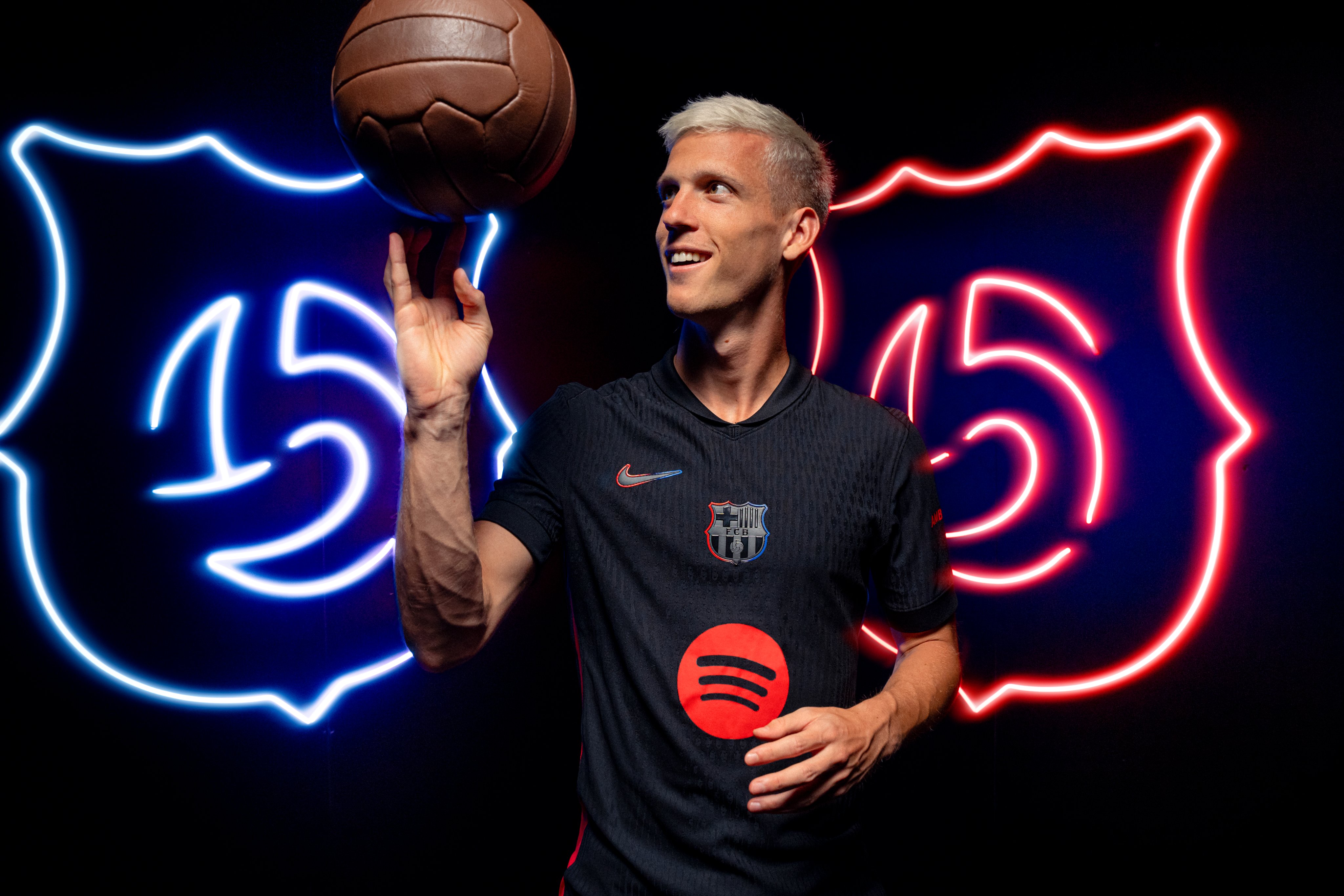
Not a fan of the big red spotify logo, takes all the attention
This!
Whenever Nike tries to produce something beautiful, after many abhorrent designs the last many years,
they always mess it up someway in the details
Now, they had the 'total black' concept, which even included blackening the crest (IMO the crest of all clubs in all kits should never change form or colour. But I will leave that aside for now)
So, the nike swoosh and the crest were blackened with only blue/red outline, not even visible.
And then they go and throw in your face a bright RED Spotify logo FFS

At least be consistent with your own ideas, and with the overall design of the kit, and blacken the spotify logo likewise... Why is it so difficult to not mess up self-evident things?


