You are using an out of date browser. It may not display this or other websites correctly.
You should upgrade or use an alternative browser.
You should upgrade or use an alternative browser.
Barca kits (new 2024-2025)
- Thread starter Andresito
- Start date
Messi983
Senior Member
So the kits on sale are as per usual two versions: stadium/fan version and 'advanced tech' version. Now it seems like the advanced tech version is advertised like that and not player version because of the Spotify logo differing (players won't wear shirts with Spotify text).
I've read the actual player versions will be released for sale later. Not sure if future stadium version will also have the new Spotify version, anybody know? I usually opt for the stadium version when buying.
Nice video.
Birdy
Senior Member
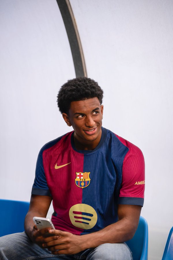
Nice but I liked it more with the letters.
Lesson on how to destroy a nice football kit:
In the initial version with the letters, both logo and letters were of similar size as nike swoosh and Barca crest (scale-wise)
Now, the spotify logo is so disproportionate to the rest (scale-wise) that it looks like a golden hole at the center of the shirt.
Thanks Nike for fucking things up again. and especially with this otherwise beautiful design
PS: more on that later, as there is some faulty choice of colours
soul24rage
Senior Member
This trend of Nike of putting the crest in the middle is atrocious.
wisconsincule
Senior Member
Agree. Im still going to purchase the kit but I dont like the placement either.This trend of Nike of putting the crest in the middle is atrocious.
Fati_Future_BallonDor
Well-known member
The new jersey looks amazing and would look even better without the spotify logo
Birdy
Senior Member
PROBLEMS with the NEW kit (Part II)
Apart from the mess up with the huge Spotify logo, there is a serious mistake in the colouring:
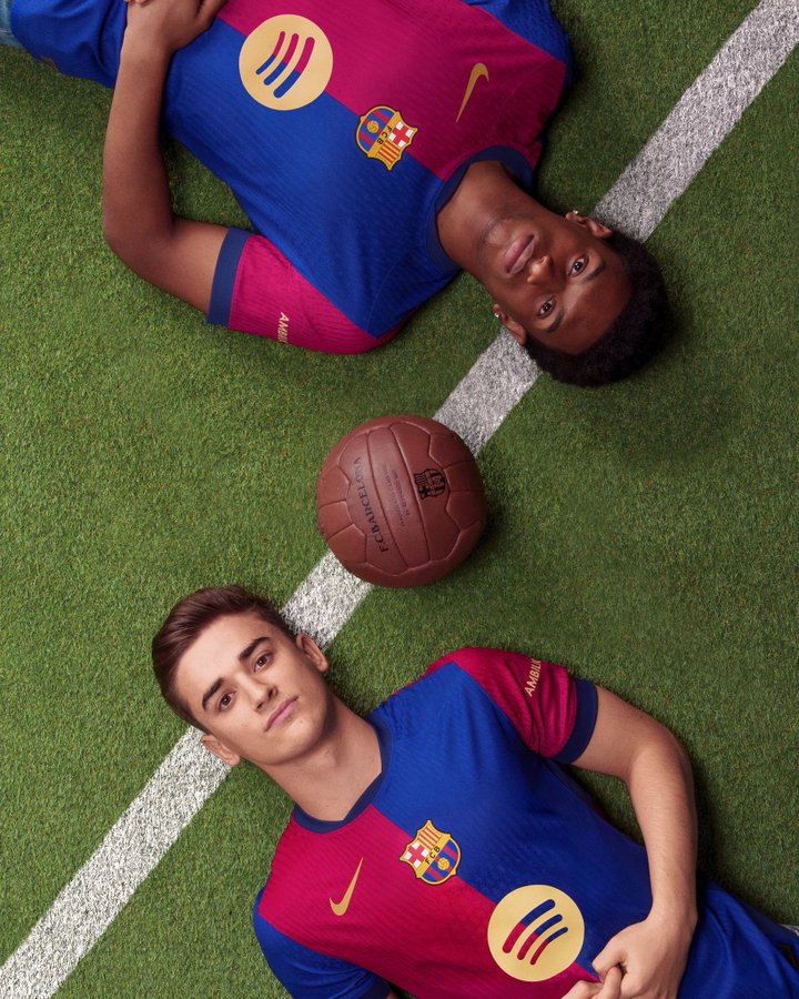
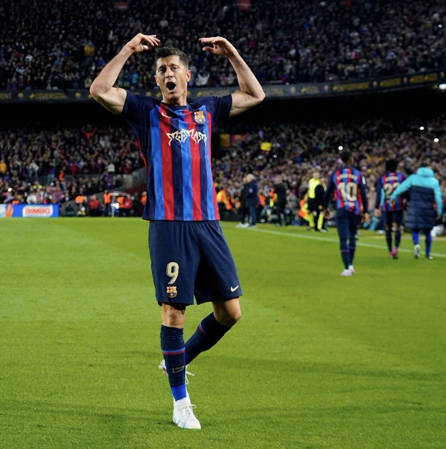
Whenever Barca uses two colours in their home kit (red, blue), you can literally pick any shade of blue whatsoever because it will make enough contrast with the red anyway.
But whenever Barca home kit has 3 colors (red,blue, and a DARK NAVY as a base), then you have to be extra careful with the shade of the blue -> There has to be ENOUGH discrimination from the navy base of the shorts and details.
That did not happen with the new kit, and it's a VERY SERIOUS failure from the part of Nike designers.
You look at the kit and the tone difference between the color of the blue stripe and the color of neck and sleeve cuffs is minimal.
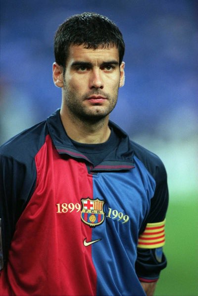
They did it correctly with the Centenary kit and the kit from 22/23, by simply picking a more light and bright blue, making the contrast and the 3 color nature of the kit pretty evident
Apart from the mess up with the huge Spotify logo, there is a serious mistake in the colouring:


Whenever Barca uses two colours in their home kit (red, blue), you can literally pick any shade of blue whatsoever because it will make enough contrast with the red anyway.
But whenever Barca home kit has 3 colors (red,blue, and a DARK NAVY as a base), then you have to be extra careful with the shade of the blue -> There has to be ENOUGH discrimination from the navy base of the shorts and details.
That did not happen with the new kit, and it's a VERY SERIOUS failure from the part of Nike designers.
You look at the kit and the tone difference between the color of the blue stripe and the color of neck and sleeve cuffs is minimal.
They did it correctly with the Centenary kit and the kit from 22/23, by simply picking a more light and bright blue, making the contrast and the 3 color nature of the kit pretty evident
soul24rage
Senior Member
I long for the days when fans have the choice of getting concept jerseys to be selected


Birdy
Senior Member
I long for the days when fans have the choice of getting concept jerseys to be selected


Looks awesome!
companyofcules
Well-known member
I think I'll wait with buying the shirt until they remove the Spotify text. Would've liked it now but will be bummed if they release new version in a month or two.
Regarding the Spotify logo:
What is the reason for the existence of these two different versions? According to La Vanguardia, the confusion arose because Spotify decided to remove the company name and only keep the logo when Nike had already started producing the first samples. Therefore, fans will have to wait until the fall, when the second phase of the kit's commercialization has begun, to acquire the version that the players will wear.
